
Review of widening market divergence: Is the rebound turning into a reversal, or is this the second distribution phase in a downward intermediate trend?
TechFlow Selected TechFlow Selected
Review of widening market divergence: Is the rebound turning into a reversal, or is this the second distribution phase in a downward intermediate trend?
Market divergence is intensifying further; which view do you agree with?
Author: Kevin, the Researcher at Movemaker
As Bitcoin's open interest rises and key price levels on liquidation maps continue to accumulate, market divergence is intensifying. Is the current move a reversal turning into a sustained uptrend, or merely a second distribution phase within a broader downtrend?
These are two mainstream perspectives observed by the author regarding future price action—each supported by numerous analysts, each grounded in distinct data sets and analytical frameworks. Yet upon closer inspection of their core reasoning, both approaches converge. Their starting point is identical: supply and demand analysis. Today’s discussion will therefore follow this thread—from supply and demand fundamentals—to explore how these two opposing conclusions arise from the same root.
Candlesticks represent price movement—the most visible manifestation of supply-demand dynamics. The fluctuation of prices reflects the shifting balance between buying and selling pressure. Each candlestick encapsulates the outcome of this tug-of-war—a compressed image of changing supply-demand structure. More deeply, buy and sell forces have varying intensity, clearly reflected in trading volume. But if we go further: why does price move? Why does it retrace at certain levels? Why do some breakouts fail?
To explain this, the author introduces a "marble theory"—a conceptual model designed to illustrate the impact of tariff policy changes and the resulting momentum shifts when supply or demand alters. Marble theory transforms abstract supply-demand relationships into tangible imagery. Narrowly defined, supply and demand can be directly seen on order books, where differing sizes of pending orders form glass-like layers with variable thickness. Every aggressive trade execution acts as a marble carrying kinetic energy. Price progression is essentially the process of these marbles striking the order book, breaking through layers of glass, and pushing price forward.
The thickness of the glass represents liquidity depth and order density at a given price level; the marble’s kinetic energy comes from the size and speed of aggressive buy or sell orders. Each price advancement occurs when a marble breaks through one layer of glass and jumps to the next. With strong enough momentum, multiple layers may be shattered consecutively; insufficient energy might stall progress or trigger a rebound. During periods of high volatility, switching to a 1-minute chart reveals such marble-like piercing trades.
This explains short-term unpredictability—it resembles chaotic motion between thick layers of glass. Compared to “price action,” marble theory emphasizes “causal structure.” Rather than predicting candle patterns, it seeks to reconstruct the physical mechanism behind price movements—an approach closer to the true nature of markets. Countless indicators stem from candlesticks combined with time and volume, most beyond today’s scope. However, those tied to supply-demand dynamics will be referenced below.
Based on marble theory, we derive the following abstractions:
Pending order thickness = Depth at a given price layer
Aggressive trades = Marbles
Trading volume = Kinetic energy of the marble
Slippage cost = Energy loss as the marble penetrates glass
From this framework, several hypotheses emerge:
- Price doesn’t move continuously but jumps discontinuously, “breaking through” successive price zones;
- Different price levels exhibit varying order densities—these differences create support and resistance;
- Larger aggressive trades carry greater momentum, enabling penetration through more “glass layers”;
- Some pending orders represent “false liquidity”—not genuine intent—when struck, they cause fake breakouts;
- Price exhibits inertia—excessive momentum may lead to overshooting, creating overheated (overbought) or oversold conditions.
This is the theoretical synthesis drawn from both viewpoints and the author’s own trading experience. One can trade based solely on candlesticks, since all supply-demand dynamics are embedded within them. Skilled traders can discern supply-demand trends and pinpoint critical turning points just by reading candles—masters simplify complexity; for them, candles alone suffice.
Two simple examples: a long bullish candle typically indicates buyers dominated during that period, absorbing available sell orders with strong momentum that pierced multiple layers of “glass”; conversely, a long bearish candle shows overwhelming selling pressure, weak buyer support, and rapid breakdown through multiple support levels—the marble propelled by intense seller intent.
If candlesticks alone don’t reveal supply-demand imbalances, additional tools become necessary—such as open interest, spot premium, and liquidation heatmaps—to gather supporting data from multiple angles. Whether viewing this rally as a reversal or a mid-downtrend second distribution depends on perspective. The former sees demand exceeding supply; the latter sees supply outweighing demand. Put simply, one camp believes the bull market continues; the other sees an entrenched bear market deepening. Subjectively, more people lean toward the first view—that the bull hasn't ended—so I’ll begin by outlining its rationale.
Viewpoint One: The Rally May Turn Into a Reversal
This viewpoint breaks down into three categories of demand-outweighs-supply scenarios, particularly concerning long-term vs. short-term holders and concentrated stacking zones—insights largely attributed to @Murphychen888, whose analyses will be frequently cited below.
First, consider the relationship between Long-Term Holders (LTH) and Short-Term Holders (STH). Shifts in the profitability status of LTHs and STHs often signal important market inflection points. The first sub-argument involves monitoring the Long-Term Holder Realized Profit Multiple (LTH-RPM) to identify potential market bottoms. When this metric shows LTHs entering widespread losses, it often suggests the market is nearing a cyclical low.
Indicator logic:
- When the proportion of profitable long-term holdings significantly declines and turns negative, realized profit margins shrink dramatically;
- Sustained loss conditions suppress selling willingness—as sellable supply diminishes, downward pressure gradually eases;
- Once selling momentum exhausts sufficiently, a natural price bottom forms.
Historical evidence:
- At the 2018 and 2022 bear market lows, unprofitable LTH coins reached 28%-30%;
- In March 2020’s extreme event, the figure climbed to ~29%;
- During bull cycles, readings of 4%-7% typically coincide with correction bottoms.
Current market characteristics:
- The share of unprofitable LTH coins has risen from near zero to 1.9%, approaching July 2024 levels;
- Bitcoin purchased at $90k–$100k in late 2024 to early 2025 is about to transition into long-term holding status (currently underwater), likely pushing this ratio higher;
- Entry into the 4%-7% threshold zone would present a more definitive accumulation opportunity.
When most long-term holders are in profit, every price bounce triggers profit-taking, creating persistent downward pressure. Historical patterns show that whether at bear market troughs or bull market pullbacks, once LTHs broadly enter loss territory, it often signals an imminent bottom. At that point, selling exhaustion makes further downside unsustainable, paving the way for stabilization and recovery. While signs of LTH “capitulation” are emerging, timing-wise this remains a left-side entry phase—albeit one with potentially attractive risk-reward.
The second argument focuses on STH-RPM—the short-term holder profitability ratio. Unlike the LTH-based left-side signal, STH-RPM serves as a right-side confirmation—evidence that current demand now exceeds supply.
Indicator logic:
- When newly acquired short-term positions shift from loss to profit, it usually reflects recovering market confidence. This shift often coincides with trend reversals and marks a key psychological turning point.
Trigger threshold:
- Once the average cost basis of short-term holders falls below their current market value (“spend basis”), it indicates a collective shift toward profitability. Their improved sentiment fuels stronger buying momentum, driving price above prior trading ranges until countered by profit-taking from long-term holders. Thus, when the “short-term holder cost line” crosses above the “spend basis line,” warming market conditions and a reversal signal appear on the chart’s right side.
This crossover hasn’t triggered yet, but the yellow line is converging toward the blue. Even so, convergence itself supports a left-side accumulation strategy.
The MVRV ratio’s extreme deviation bands can also be viewed as glass layers of different thickness. When overall valuation returns to breakeven, few are willing to exit at further losses—downward marble momentum weakens. This implies most participants still believe in Bitcoin’s long-term outlook despite short-term swings. In a true “bearish sentiment” environment, a breach below key cost levels would spark cascading panic sales—not the swift stabilization currently observed. Combined with the current profitability landscape among LTHs and STHs, plus weakening downside momentum, we can infer: the market is very close to a local bottom, offering compelling left-side entry value.
The second category examines the supply-demand dynamic between stablecoins and Bitcoin—specifically BTC-SSR (Bitcoin Supply Ratio).
BTC market cap divided by total stablecoin market cap measures Bitcoin’s ability to draw liquidity from the stablecoin pool. A rising ratio increases the likelihood of price appreciation; a declining one suggests weakening momentum.
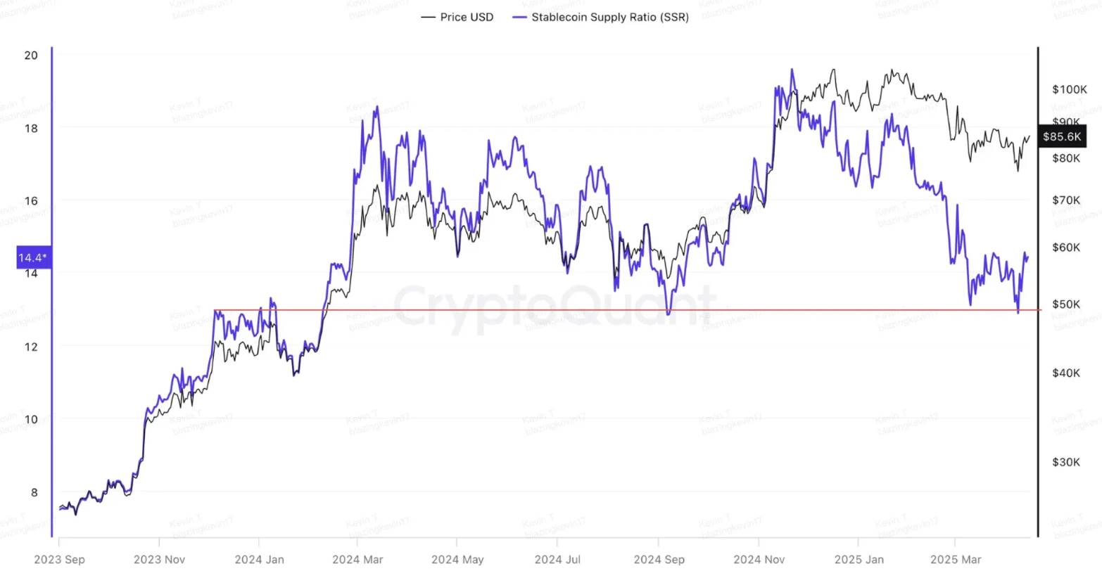
From the BTC-SSR trend, we see that since the end of 2023, any divergence between Bitcoin and stablecoin supplies was quickly corrected as stablecoins flowed back into Bitcoin, pulling BTC-SSR back into range. Two peaks occurred: March 13, 2024 ($73k), and November 21, 2025 ($98k). Four local lows appeared on August 5 and September 6 last year, March 10 and April 8 this year—all corresponding to local price bottoms. Further examination of stablecoin vs. Bitcoin market cap reveals that whenever the two diverge, BTC-SSR rapidly declines until reaching the proportion seen at the start of the 2023 rally—indicating accumulating demand pressure. Once hitting this demand zone, pent-up energy releases immediately. Currently, stablecoin supply continues to accelerate upward, suggesting inflows could lift Bitcoin’s market cap—provided the bull market narrative remains intact and hasn’t vanished.
The third argument centers on dual anchor effects formed by high- and low-price concentration zones.
This idea also originates from Murphy. We’ve expanded supply-demand definitions from narrow order book views to include long- and short-term holder behavior—now extending further across time. A key metric here is dense stacking zones.
Indicator logic:
- High-volume accumulation in specific price ranges reflects broad consensus and strategic positioning. On the way down, holders who bought high resist selling—forming a “damping force,” like branches on a cliff slowing a fall. Conversely, those who bought low expect upside and hold firm—like rocky outcrops anchoring the descent. Together, these forces build critical structural support.
Historical support:
- In June 2024, ~8% of supply accumulated between $39,000–$43,000, forming clear support; $60,000–$68,000 held 12%, acting as strong resistance. Between July and August, amid external shocks (e.g., German government BTC sales and yen carry-trade unwinds), price oscillated between $43,000 and $60,000—validating these stacking zones as buffers. On August 5, 2024, BTC dipped to $49,000—precisely between the two zones—confirming the anchoring power of supply structure.
- In November 2022, post-FTX collapse, BTC stabilized between $6,000–$10,000 (13% supply) and $18,000–$22,000 (19%). It briefly fell to $15,500 on November 9—right between the two layers—demonstrating even under extreme fear, stacking zones provided stability.
Failed anchoring case:
- In March 2022, after peaking at $69,000, BTC consolidated around $35,000–$45,000 for nearly two months. Market sentiment was split—one side saw a bull correction, the other a bear onset. But stacking data showed no concentrated support below; holdings were evenly spread from $25,000 to $66,000. True structural support lay far below at $6,000–$12,000. Under panic-driven selling, price swiftly broke through the range, confirming bearish dominance.
Current situation:
- Today, ~11% of supply is stacked in both $60,000–$70,000 and $93,000–$100,000, forming a symmetrical dual-layer structure. Historically, such configurations tend to confine price action between $70,000 and $93,000. As long as this stacking remains intact, the price equilibrium—or “consensus center”—is likely to stabilize between these two zones. The anchor theory aligns with marble theory: price momentum behaves like a stretched rubber band. As price moves toward lower-density zones, upward potential builds—and before touching the lower stack, rebound energy discharges. Therefore, $70,000 is expected to serve as a resilient core support in this cycle.
After analyzing arguments favoring a reversal, let’s assess tariffs’ role in this process. Key conclusion: the shock impact of isolated events tends to decay over time—especially if the event doesn’t escalate further.
The recent market correction driven by tariff expectations unfolded in three phases: February 25–28, March 10–13, and April 7–10.
An objective measure of shock intensity across stages is investors moving losing assets into Binance during downturns. Data shows realized losses peaked at $139 million in Phase One—far exceeding $43.92 million and $58.9 million in subsequent phases. This chain-visible decline indicates initial psychological impact was strongest, with later reactions progressively muted.
Sharp sell-offs pushed price back into demand zones. Moreover, Trump is unlikely to issue more negative tariff signals than already seen. Tariff threats against most nations follow a “high threat, light impact” pattern—limited destructive power. The 10% reciprocal tariff has already achieved political objectives. Given U.S. Treasury yields cannot withstand further sell-off pressure, Trump must operate within bounds that avoid triggering bond market panic—thereby capping tariff-related damage. Consequently, the supply-side boost from tariffs begins to fade, downward momentum wanes. Market sentiment gradually improves, short-term holders edge toward profitability, long-term holder selling pressure remains distant, and substantial stablecoin inflows into Bitcoin remain possible. These factors support the view that the current rally could evolve into a sustained reversal—with increasing appeal for early entries.
Viewpoint Two: The Current Rally Is a Second Distribution After Accumulation
This camp sees the current phase as a mid-downtrend second distribution en route to a prolonged bear market. Macro concerns include tariff-driven inflation worsening into stagflation, accelerating recession risks. But the central thesis rests on the belief that U.S. equities have entered a technical bear market—continued decline is inevitable, and Bitcoin cannot decouple; it will be dragged down alongside stocks. Below is the rationale for determining that U.S. equities have indeed entered a technical bear phase.
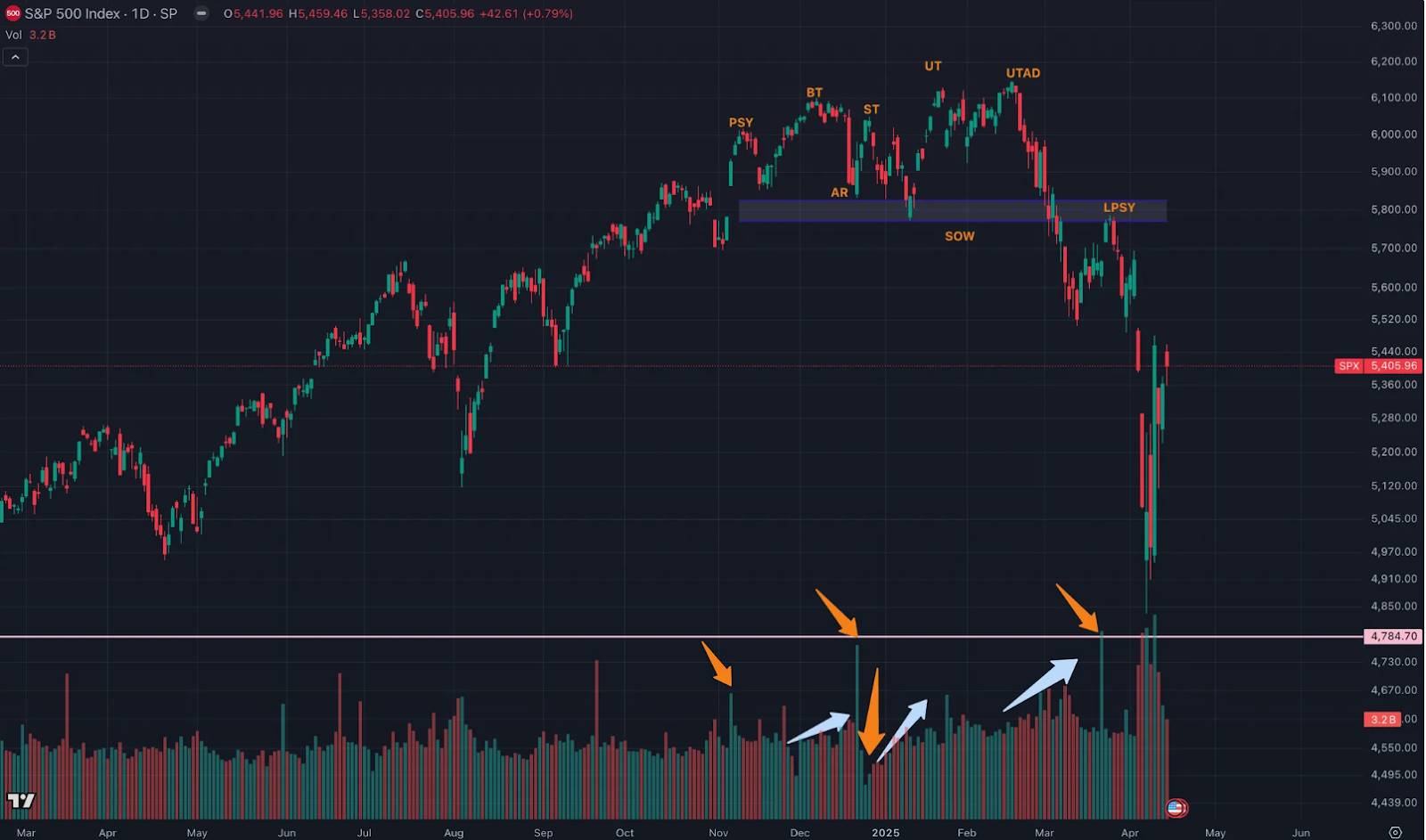
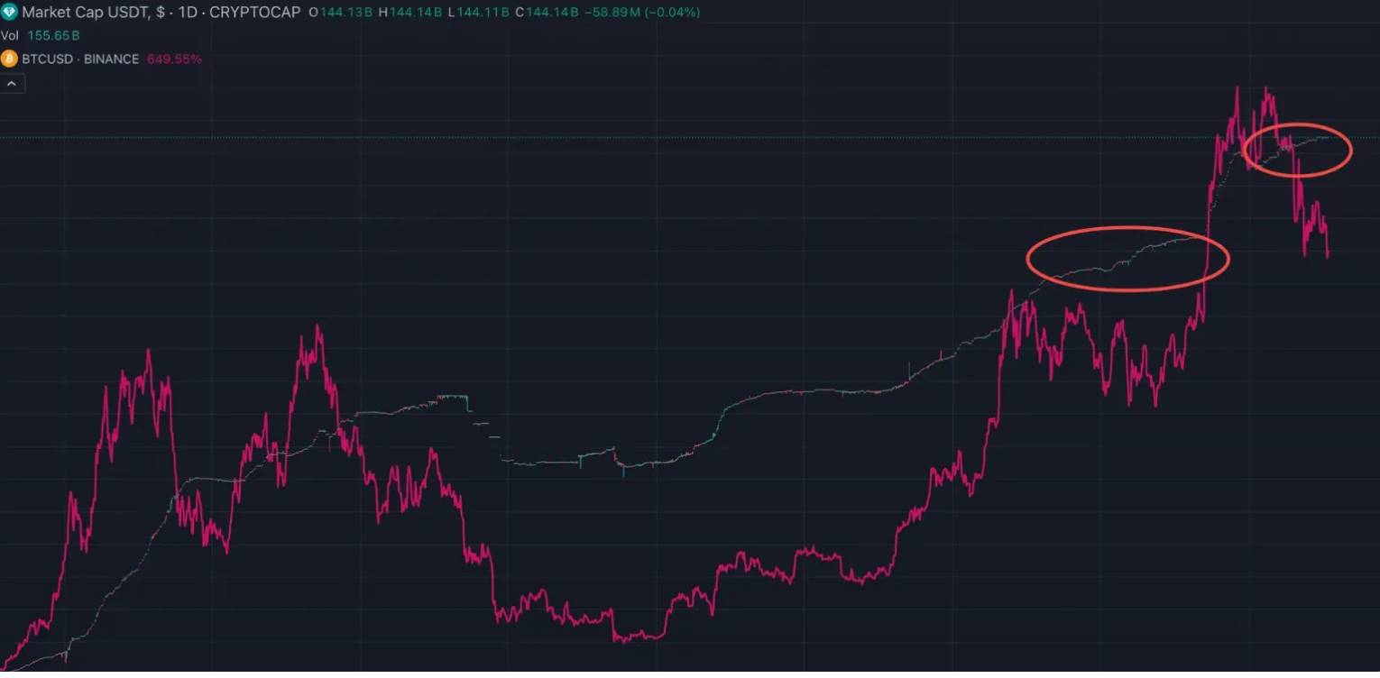
This view holds that U.S. equity price action over recent months perfectly matches Wyckoff’s distribution phase. The argument hinges on price-volume behavior—volume-price dynamics. Yellow arrows highlight daily volume patterns; light blue arrows indicate volume trends over extended periods.
November 6: Sharp price rise accompanied by expanding volume and spread signaled an approaching阶段性 high—PSY (Preliminary Supply)—initial distribution point.
Late November to early December: BC (Buying Climax)—peak accumulation zone. Volume and spread surge as sellers absorb frantic public buying near market tops.
December 18: AR (Automatic Reaction)—natural pullback after climax. Buying dries up while selling persists, causing organic decline. The low of this drop helps define the base of the distribution range.
December 20: ST (Secondary Test)—first sign of absorption. Price rebounds toward the BC zone to test supply-demand balance. Upon nearing resistance, volume should shrink and spreads narrow—indicating supply dominates and confirms the top.
End of December to early January: SOW (Sign of Weakness). Occurs near the end of distribution—price drops to or slightly below the distribution floor, often with rising volume and widening spreads. SOW signals sellers are firmly in control.
January 13–23: UT (Upthrust) —a bull trap. Designed to lure final longs and stop out early shorts. Price appears to break resistance, but it’s deceptive—operators hide impending downside.
February 19: UTAD (Upthrust After Distribution). Final test of residual demand after confirmed distribution. Price briefly pierces resistance before reversing—last chance to offload inventory.
February 19 to early March: Demand fails—accelerated capitulation on rising volume.
March 25: LPSY (Last Point of Supply). Despite strong buying volume, after SOW tests ice-level support, price struggles to rise—spreads narrow. This shows difficulty advancing—either due to dried-up demand or dominant supply. LPSY marks final distribution before steep decline.
U.S. equities’ price pattern and corresponding volume behavior fully align with Wyckoff’s distribution model—proving the bull run has ended and distribution completed. Next, the market needs an LPS (Last Point of Support) to eventually turn bullish. Until then, rallies are traps—ideal for shorting.
The divide between the two mainstream views ultimately hinges on expectations for U.S. equities and Bitcoin’s potential to decouple: If equities cannot stabilize, can Bitcoin stand alone? Or can equities bottom here while Bitcoin leads upward?
Market divergence grows sharper—where do you stand?
About Movemaker: Movemaker is the first official community organization authorized by the Aptos Foundation and jointly launched by Ankaa and BlockBooster, dedicated to advancing the development of the Aptos Chinese-speaking ecosystem. As the official representative of Aptos in the Chinese-speaking region, Movemaker aims to connect developers, users, investors, and ecosystem partners to build a diverse, open, and thriving Aptos ecosystem.
Disclaimer: This article/blog is for informational purposes only and represents the personal opinions of the author, not necessarily the position of Movemaker. It does not constitute: (i) investment advice or recommendation; (ii) an offer or solicitation to buy, sell, or hold digital assets; or (iii) financial, accounting, legal, or tax advice. Holding digital assets—including stablecoins and NFTs—carries significant risk, including high price volatility and the potential for total loss. You should carefully evaluate whether trading or holding digital assets is suitable for your financial circumstances. For specific questions, please consult your legal, tax, or investment advisor. Information provided herein (including market data and statistics, if any) is for general reference only. Reasonable care has been taken in compiling data and charts, but no responsibility is accepted for any factual inaccuracies or omissions.
Join TechFlow official community to stay tuned
Telegram:https://t.me/TechFlowDaily
X (Twitter):https://x.com/TechFlowPost
X (Twitter) EN:https://x.com/BlockFlow_News