
How to predict market trends and potential price movements?
TechFlow Selected TechFlow Selected
How to predict market trends and potential price movements?
Please keep this guide to interpreting cryptocurrency candlestick charts.
Written by: Siddhant Kejriwal, CoinBureau
Translated by: Glendon, Techub News
Cryptocurrency trading primarily operates through two main mechanisms: liquidity pools on decentralized exchanges (DEXs) and order books on centralized exchanges (CEXs). On DEXs, liquidity pools aggregate funds within smart contracts, enabling peer-to-peer trading without traditional intermediaries. In contrast, CEXs use order books that list buy and sell orders, facilitating trades by matching these orders. The order book model is more prevalent, offering traders access to detailed candlestick charts that depict the historical price movements of assets.
Candlestick charts are indispensable tools in trading—each candle summarizes price movements over a specific period, providing insights into market sentiment and potential future price trends. By mastering candlestick interpretation, traders can identify market trends and effectively understand the collective behavior of market participants over time.
This guide is designed for cryptocurrency beginners and aims to provide an in-depth explanation of how to read crypto candlestick charts. While its fundamental principles align with those of traditional asset markets (such as stock markets), the unique characteristics of the crypto market—high volatility, 24/7 trading, and fluctuating liquidity—add distinctive nuances to candlestick analysis in this space. This guide will explore these differences, equipping readers with practical knowledge to navigate the complexities of cryptocurrency trading.
Candlestick Chart Basics
Candlestick charts are foundational tools in financial analysis, visually representing how an asset’s price changes over time. In cryptocurrency trading, these charts are crucial for understanding market behavior and making informed decisions.
Key Features of Candlestick Charts:
-
Price Movement Over Time: Candlesticks display the fluctuations in an asset’s price over a given period, offering insights into market trends and volatility.
-
Multiple Timeframes: These charts can be plotted across various time intervals—from seconds to months—enabling traders to analyze short-term fluctuations or long-term trends.
-
Visual Cues: Candlesticks use shape and color to dynamically represent trading data, allowing traders to quickly interpret market sentiment at a glance.
-
Pattern Recognition: By observing recurring patterns, traders can identify potential entry and exit points and anticipate future price movements.
-
Technical Indicators: Charting platforms typically offer multiple indicators that present data from different perspectives, enhancing the depth of price analysis.
Structure of a Candlestick
Candlestick structure | Image via Pocketful
Understanding the components of a candlestick is essential for effective chart interpretation:
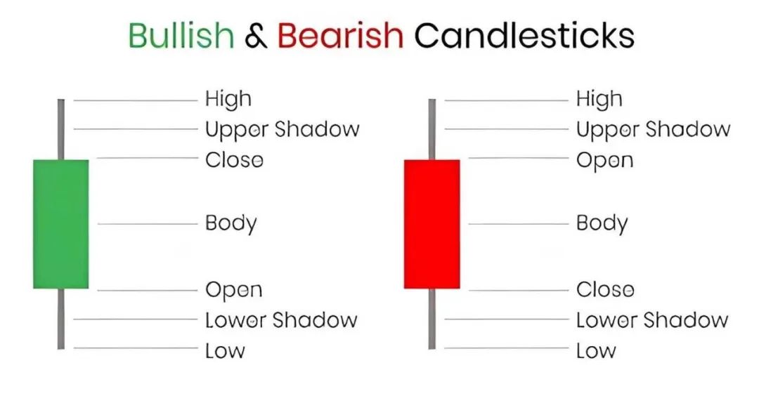
1. Body: The rectangular area between the opening and closing prices. A red body indicates a downward period (close < open), while a green body represents an upward period (close > open).
2. Wicks (Upper and Lower Shadows): The thin lines extending from the body indicate the highest and lowest prices during the period. The upper wick shows the peak price, and the lower wick reflects the lowest price.
3. Open, High, Low, Close (OHLC): Each candlestick contains these four data points:
-
Open: The price at the beginning of the period.
-
High: The highest price reached.
-
Low: The lowest price reached.
-
Close: The price at the end of the period.
4. Bullish and Bearish Candlesticks: Green (or white) candles indicate an uptrend—closing price higher than opening price. Conversely, red (or black) candles signal a downtrend—closing price lower than opening price.
Timeframes and Their Significance
Candlestick charts can be constructed using different timeframes, each serving distinct trading strategies:
-
Short-Term Timeframes (1 minute to daily): These charts capture minute-by-minute price movements, offering opportunities for rapid trades. Ideal for day traders seeking to profit from intraday volatility.
-
Medium-Term Timeframes (daily to weekly): Suited for swing traders aiming to benefit from price swings over several days. These charts filter out some of the noise found in shorter timeframes, offering a clearer view of emerging trends.
-
Long-Term Timeframes (weekly to monthly): Preferred by long-term investors focused on overall market trends. Since hourly data may be irrelevant, they rely on daily or weekly candles to make informed decisions.
Selecting a timeframe aligned with your trading goals helps filter out unnecessary data, enabling more focused analysis. Candlestick charts intuitively reflect how market sentiment toward an asset evolves over time.
How to Interpret Cryptocurrency Candlestick Patterns
Candlesticks are more than just visual representations of price movements—they form distinct patterns that reveal market sentiment toward an asset. Recognizing these formations can help traders anticipate potential price shifts and make informed decisions.
Candlestick Shape and Size
The shape and size of each candle convey specific information about trading activity during a given period:
-
Body Length:
-
Long Body: Indicates strong buying or selling pressure. A long green (bullish) body means buyers dominated the session, pushing prices up. Conversely, a long red (bearish) body suggests sellers were in control, driving prices down.
-
Short Body: Reflects indecision or balance between buyers and sellers. This often leads to Doji patterns, where opening and closing prices are nearly identical.
-
Wick Length:
-
Long Upper Wick: Shows buyers pushed prices higher during the session, but sellers drove them back down before close—indicating potential resistance.
-
Long Lower Wick: Indicates sellers pushed prices down initially, but buyers later reversed the move, signaling potential support.
-
Short Wicks: Suggest that opening and closing prices were near the session's high and low, indicating a decisive move with little opposition.
By analyzing these shapes, traders can assess market sentiment and forecast future price movements. For example, a candle with a long lower wick and a small body near the top (a hammer) might suggest a potential bullish reversal after a downtrend.
Basic Chart Patterns
Understanding basic candlestick patterns is key to interpreting market behavior. Depending on their formation and the prevailing trend, these patterns can be bullish or bearish.
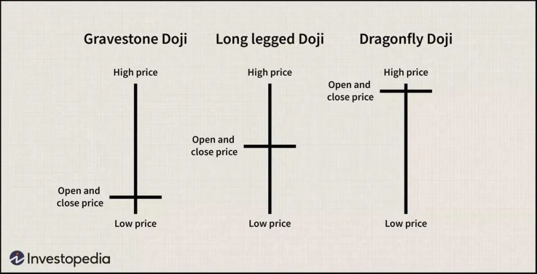
Doji
-
A Doji occurs when the opening and closing prices are nearly equal, resulting in a very small or nonexistent body.
-
This pattern signals market indecision. The length of the wicks provides additional context—long wicks indicate significant volatility during the session.
-
A Doji at the bottom of a downtrend may foreshadow a bullish reversal, while one at the top of an uptrend could indicate a bearish reversal.
Doji Pattern | Image via Investopedia
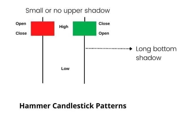
Hammer
-
Features a small body at the upper end of the trading range with a long lower wick, resembling a hammer.
-
Indicates that sellers pushed prices down, but buyers regained control and pushed prices higher. Often seen as a bullish reversal signal following a downtrend.
-
Generally considered a bullish signal, especially when appearing after a decline.
Hammer Pattern | Image via Intradayscreener
Shooting Star
-
Has a small body at the lower end of the trading range with a long upper wick, resembling a shooting star.
-
Suggests buyers pushed prices up, but sellers took over, causing prices to drop. Typically viewed as a bearish reversal signal after an uptrend.
-
Usually a bearish signal, particularly when occurring after a rally.
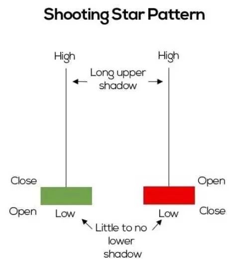
Shooting Star Pattern | Image via ThinkMarkets
Evening Star
-
A three-candle pattern: first, a large bullish candle; second, a small-bodied candle (bullish or bearish); third, a large bearish candle closing below the midpoint of the first candle.
-
Signals a potential bearish reversal after an uptrend. The small middle candle reflects hesitation, and the final bearish candle confirms the reversal.
-
Bearish signal, especially when the third candle closes below the midpoint of the first.
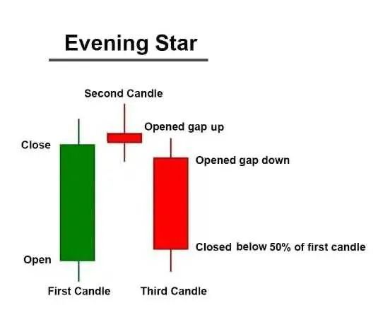
Evening Star Pattern | Image via StockDaddy
Harami Pattern
-
A pattern where a large candle is followed by a smaller candle whose body is entirely contained within the prior candle’s body.
-
Signals a potential reversal. A "bullish harami" appears in a downtrend, suggesting an upward reversal, while a "bearish harami" in an uptrend hints at a downward reversal.
-
The position and color of the candles define the meaning. A bullish harami is a large red candle followed by a small green one; a bearish harami is a large green candle followed by a small red one.
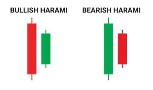
Harami Pattern | Image via asiaforexmentor
Engulfing Pattern
-
A two-candle pattern where a small candle is followed by a larger one whose body completely engulfs the previous candle’s body.
-
A "bullish engulfing" in a downtrend suggests a potential upward reversal, while a "bearish engulfing" in an uptrend indicates a possible downward reversal.
-
In a bullish engulfing, a small red candle is followed by a large green candle. In a bearish engulfing, a small green candle is followed by a large red one.
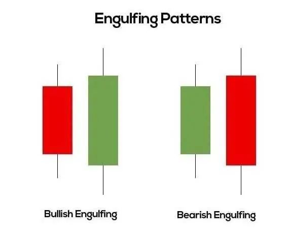
Engulfing Pattern | Image via Medium
Indicators, Not Oracles
It's important to note that while these patterns offer valuable insights, they are not foolproof. They represent probabilities, not certainties. Actual market movements depend on numerous factors, including market sentiment, economic indicators, and geopolitical events.
With experience and practice, traders begin to notice subtle, context-specific patterns that significantly enhance trading accuracy. Developing a sharp eye for these nuances is a skill honed over time—and essential for successful trading.
Technical Indicators and Tools
In cryptocurrency trading, technical indicators are vital tools that help traders analyze price movements and make informed decisions. Knowing how to use them can strengthen your trading strategy and improve your ability to predict market trends.
Moving Averages (MA)
Moving averages smooth out price data by creating a single flowing line, making it easier to identify the direction of a trend over a specific period.
How They’re Built:
1. Simple Moving Average (SMA): Calculated by summing the closing prices of an asset over a certain number of periods and dividing by that number. For example, a 10-day SMA adds the past 10 days’ closing prices and divides by 10.
2. Exponential Moving Average (EMA): Applies weighted calculations to historical prices, giving more importance to recent data, making it more responsive to new information. It uses a more complex formula that applies a multiplier to the latest price data.
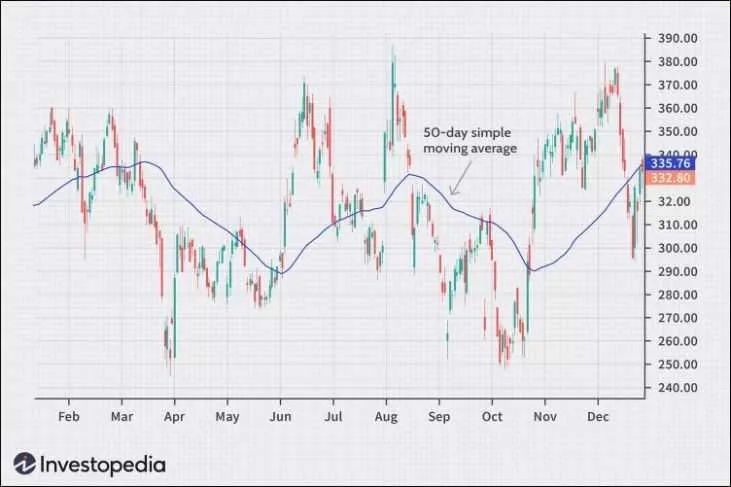
Moving Average Indicator | Image via Investopedia
Moving averages help determine the overall trend direction. When price is above the MA, it suggests an uptrend; when below, a downtrend. They also act as dynamic support and resistance levels. For instance, in an uptrend, the moving average may serve as support, where prices tend to bounce back.
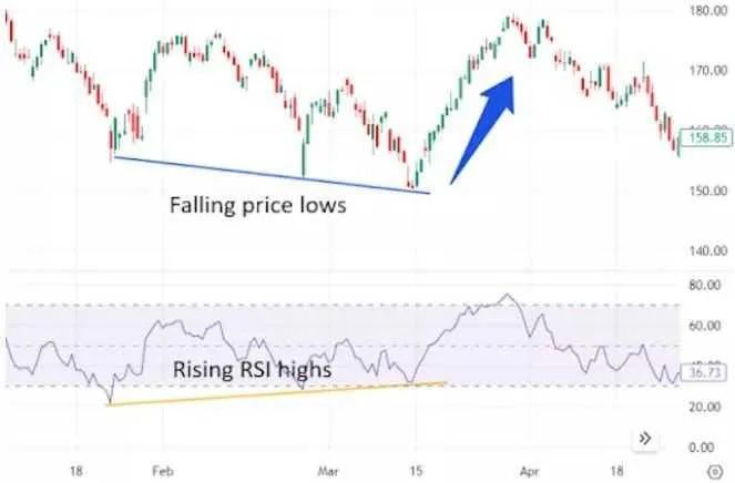
Relative Strength Index (RSI)
RSI is a momentum oscillator that measures the speed and magnitude of price changes, helping identify "overbought" or "oversold" conditions. (Techub News note: Overbought refers to an asset’s price rising to a level unsupported by fundamentals, often after a sharp increase, meaning a downward correction is likely. Oversold means the asset has dropped significantly and may rebound shortly.)
1. How It’s Built: RSI is calculated using the formula: RSI = 100 - [100 / (1 + RS)], where RS (Relative Strength) is the average of 'n' days’ upward closes divided by the average of 'n' days’ downward closes. The default period is 14 days.
2. Interpretation: RSI values range from 0 to 100. Values above 70 typically indicate overbought conditions, suggesting a potential downward correction. Values below 30 suggest oversold conditions, implying a potential upward correction. Traders use RSI to spot potential turning points and confirm trend strength.
RSI Indicator | Image via Investopedia
Bollinger Bands
Bollinger Bands measure market volatility and provide relative definitions of an asset’s high and low prices.
1. How They’re Built: Bollinger Bands consist of three lines: the middle band is a simple moving average (usually 20 periods), and the upper and lower bands are two standard deviations above and below the middle band.
2. Interpretation: Widening bands indicate increasing volatility; narrowing bands suggest decreasing volatility. Prices touching the upper band may signal overbought conditions, while touching the lower band may indicate oversold conditions. Traders use Bollinger Bands to identify potential breakout points and assess trend strength.
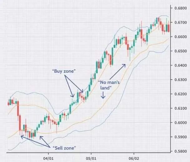
Bollinger Bands | Image via Investopedia
Volume Analysis
Volume analysis examines the number of shares or contracts traded in an asset, offering insight into the strength behind price movements.
1. How It’s Built: Volume is typically displayed as a histogram at the bottom of a price chart, showing the number of units traded during a specific period.
2. Interpretation: High volume during a price rise indicates strong buying interest and a robust trend. High volume during a price drop reflects strong selling pressure. Conversely, low volume may signal weak interest and a fragile trend. Volume spikes often precede major price moves and can act as leading indicators of market shifts.
Combining Indicators for Deeper Insights
While each indicator offers valuable information, relying on multiple indicators simultaneously can sometimes lead to conflicting signals. It's crucial to test different combinations to find what complements your trading strategy.
For example, use volume as a constant gauge of trend strength, then switch between moving averages and Bollinger Bands to identify trends and assess volatility.
By thoughtfully combining indicators, you gain a more nuanced understanding of market dynamics and improve your ability to forecast price movements.
Advanced Charting Techniques
Let’s now discuss advanced indicators—essential tools for experienced cryptocurrency traders. Understanding these can offer deeper insights into market dynamics and help predict potential price movements. However, these patterns are complex and don’t provide direct signals. Their subjective nature requires skill and experience to interpret effectively. But once mastered, they can offer early and profitable trading opportunities.
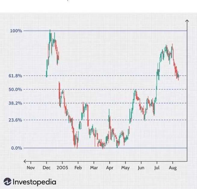
Fibonacci Retracement Levels
Fibonacci retracement levels are used to identify potential support and resistance zones on cryptocurrency price charts. Traders use these levels to predict where a price pullback might stall or reverse within an existing trend. These levels help traders make decisions about entry and exit points.
Fibonacci Retracement Levels | Image via Investopedia
How Are Fibonacci Retracements Built?
The Fibonacci sequence is a series where each number is the sum of the two preceding ones (e.g., 0, 1, 1, 2, 3, 5, 8, 13, 21, etc.). In trading, specific ratios derived from this sequence (like 23.6%, 38.2%, 50%, 61.8%, and 78.6%) are used for analysis.
Steps to Apply Fibonacci Retracements on Crypto Charts:
-
Identify Key Points: Locate significant peaks (swing highs) and troughs (swing lows) on the chart.
-
Apply the Fibonacci Tool: Use charting software to draw retracement levels between these two points. The tool automatically places horizontal lines at key Fibonacci ratios.
-
Interpretation: These lines indicate potential support (where price might stop falling and reverse up) and resistance (where price might stop rising and turn down).
So, what do Fibonacci retracements tell us?
The indicator highlights areas where crypto prices may pause or reverse within the current trend:
-
Support in Uptrends: During a pullback, retracement levels suggest where buying interest may resume, supporting the price.
-
Resistance in Downtrends: During a rally, these levels indicate where selling pressure may increase, potentially halting further gains.
Practical Application in Crypto Context
In crypto markets, prices often move violently, making Fibonacci levels valuable for predicting potential reversal points. However, their effectiveness can be limited by:
-
Subjectivity: Choosing the correct swing highs and lows can be subjective. Different traders may pick different points, leading to varying retracement levels.
-
Market Volatility: Due to high volatility, cryptocurrencies may quickly break through standard retracement levels, reducing their reliability.
Combining with Other Indicators:
To improve accuracy, traders often pair Fibonacci levels with other technical tools:
-
Moving Averages: To confirm trend direction.
-
Candlestick Patterns: To spot potential reversal signals.
-
Volume Indicators: To assess the strength behind price moves.
While Fibonacci retracements require careful analysis, they can provide early signals of potential market reversals. Traders who skillfully apply them in the crypto context may gain a competitive edge and capture profits ahead of others.
Ichimoku Cloud
The Ichimoku Cloud, or Ichimoku Kinko Hyo, is a comprehensive indicator that offers a holistic view of an asset’s trend, momentum, and potential support/resistance levels—all at a glance. In crypto trading, it’s used to determine the overall trend direction and identify potential buy or sell signals.
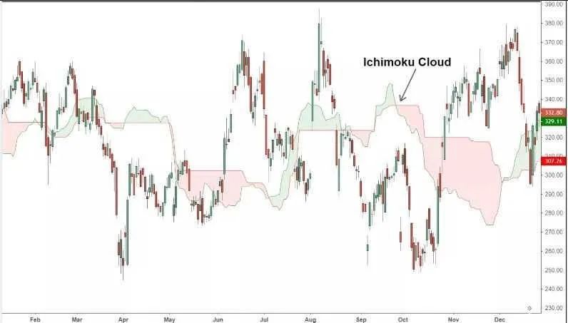
Ichimoku Cloud | Image via Investopedia
How Is the Ichimoku Cloud Built?
The Ichimoku system consists of five lines and a cloud, each calculated differently:
-
Tenkan-sen (Conversion Line):
-
Calculation: (9-period high + 9-period low) / 2
-
Represents a short-term moving average.
-
Kijun-sen (Base Line):
-
Calculation: (26-period high + 26-period low) / 2
-
Serves as a medium-term trend indicator.
-
Senkou Span A (Leading Span A):
-
Calculation: (Conversion Line + Base Line) / 2, plotted 26 periods ahead
-
Senkou Span B (Leading Span B):
-
Calculation: (52-period high + 52-period low) / 2, plotted 26 periods ahead
-
Kumo (Cloud):
-
The area between Leading Span A and B
-
The cloud projects forward, offering future support and resistance levels
-
Chikou Span (Lagging Span):
-
Current closing price plotted 26 periods backward
-
Helps visualize the relationship between current and past prices.
What Does the Ichimoku Cloud Tell Us? It Offers a Multi-Dimensional View:
-
Trend Identification:
-
Price above the cloud: Indicates an uptrend.
-
Price below the cloud: Indicates a downtrend.
-
Price within the cloud: Suggests consolidation or sideways movement.
-
Support and Resistance:
-
The cloud itself acts as dynamic support in uptrends and dynamic resistance in downtrends.
-
Momentum and Signals:
-
Bearish Signal: Tenkan-sen crosses below Kijun-sen.
-
Both lines are below the cloud.
-
The forward cloud is red (Span A below Span B).
-
Bullish Signal: Tenkan-sen crosses above Kijun-sen.
-
Price is above the cloud.
-
The forward cloud is green (Span A above Span B).
Practical Application in Crypto Context
In Crypto Markets:
-
Volatility Impact: Rapid price changes may cause frequent line crossovers, generating false signals.
-
Subjectivity: Interpreting cloud signals requires experience; novice traders may find conflicting indications.
-
Timeframe: Effectiveness varies across timeframes. Longer timeframes may yield more reliable signals.
Combining with other indicators to reduce subjectivity:
-
Volume Analysis: Confirms signal strength.
-
RSI or MACD: Validates momentum suggested by Ichimoku.
-
Support and Resistance: Combines cloud signals with traditional levels for greater reliability.
The Ichimoku Cloud is a powerful tool—complex yet capable of offering early insights into market trends. For crypto traders willing to invest time in mastering it, this indicator can become an indispensable part of a comprehensive trading strategy.
Wyckoff Accumulation and Distribution Patterns
Wyckoff accumulation and distribution patterns help traders understand the structural phases of the market, particularly focusing on the actions of large institutional players (often called “whales” in crypto). By identifying accumulation and distribution phases, traders can anticipate major market moves and adjust their strategies accordingly.
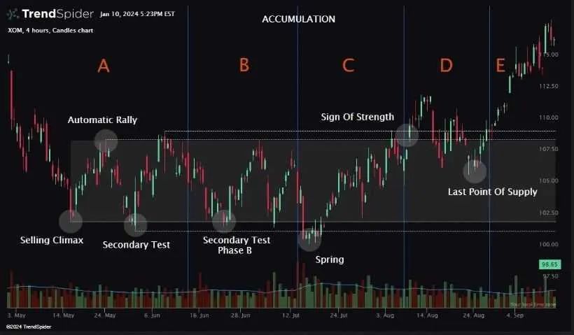
Wyckoff Accumulation Pattern | Image via trendspider
How Is the Wyckoff Method Built?
The Wyckoff approach divides the market cycle into four stages:
-
Accumulation: Institutions build large positions without significantly affecting the price.
-
Markup: After accumulation, price begins to rise as demand exceeds supply.
-
Distribution: Institutions sell their holdings to retail investors at higher prices.
-
Markdown: After distribution, price falls due to increased supply.
Key Elements of the Accumulation Phase:
-
Phase A: Initial support and selling climax halt the downtrend.
-
Phase B: Institutions quietly accumulate; price consolidates.
-
Phase C: A "spring" or shakeout tests supply, often triggering retail stop-losses.
-
Phase D: Price breaks above resistance; uptrend begins.
-
Phase E: Demand dominates; strong uptrend continues.
Key Elements of the Distribution Phase:
-
Phase A: Initial supply and buying climax halt the uptrend.
-
Phase B: Institutions distribute holdings; price oscillates within a range.
-
Phase C: An upthrust serves as a final test; price briefly exceeds resistance before reversing.
-
Phase D: Price breaks below support; downtrend begins.
-
Phase E: Supply dominates; strong downtrend continues.
What does the Wyckoff method reveal about financial markets? It uncovers the intentions of key market players:
-
Accumulation: Suggests a potential uptrend as large players build positions.
-
Distribution: Indicates a potential downtrend as large players exit positions.
Practical Application in Crypto Context
In crypto markets:
-
Market Manipulation: The presence of whales makes Wyckoff’s focus on institutional behavior highly relevant.
-
Volatility: Rapid price moves may distort traditional Wyckoff phases, making them harder to identify.
-
Subjectivity: Pinpointing exact phases requires careful analysis; misinterpretation can lead to losses.
Combining with other indicators to boost effectiveness:
-
Volume Analysis: High volume in specific phases confirms institutional activity.
-
Price Action: Candlestick patterns provide additional clues.
-
Market Sentiment: News and social media trends may support Wyckoff interpretations.
While mastering the Wyckoff method is challenging, it offers profound insights into the cyclical nature of crypto markets. Traders skilled in spotting accumulation and distribution patterns can position themselves advantageously before major market moves.
Understanding Complexity and Subjectivity
It must be emphasized that these advanced indicators and patterns are not infallible:
-
No Clear Signals: They often suggest tendencies rather than definitive buy/sell signals.
-
Subjectivity: Personal interpretation plays a big role; two traders may draw different conclusions from the same chart.
-
Market Conditions: External factors like regulatory news, tech developments, or manipulation can override technical signals in fast-moving crypto markets.
Maximizing Benefits
To use these indicators effectively:
-
Develop Skills: Invest time in learning and practicing to master these tools.
-
Combine Methods: Use multiple indicators and analytical techniques to confirm potential signals.
-
Stay Informed: Keep up with market dynamics and developments that may affect technical analysis.
-
Risk Management: Always employ sound risk management strategies to protect capital.
By acknowledging complexity and adopting a disciplined, informed approach, you can leverage these advanced charting techniques to gain a competitive edge in cryptocurrency trading.
Unique Characteristics of the Cryptocurrency Market
The cryptocurrency market differs significantly from traditional financial markets. Understanding these unique aspects is crucial for traders to navigate the crypto landscape effectively.
High Volatility
Causes of Crypto Market Volatility
-
Speculation and Hype: Crypto markets are highly speculative, with prices often driven by investor sentiment rather than intrinsic value. Positive news or rumors can trigger rapid price surges, while negative information can cause sharp declines.
-
Regulatory News and Events: Announcements about crypto regulation can have major price impacts. For example, news of potential bans or approvals by governments can cause widespread market swings.
-
Market Manipulation: Compared to traditional assets, cryptocurrencies have relatively low market caps, making them vulnerable to manipulation by large holders (“whales”) who can influence prices through large trades.
To manage this volatility:
-
Diversify your portfolio.
-
Use stop-loss and limit orders.
-
Stay updated on market developments.
24/7 Market Trading
Impact of Continuous Markets on Trading Habits
Unlike traditional financial markets, cryptocurrency markets operate continuously, with no closing hours. This constant activity can lead to:
-
Increased Stress: The market’s continuity may require traders to monitor prices constantly, leading to burnout.
-
Missed Opportunities: Major price moves can happen at any time, potentially causing traders to miss opportunities during non-trading hours.
Meeting the demands of a 24/7 market:
-
Use automated alerts.
-
Implement automated orders.
Low Liquidity
Impact of Low Liquidity on Slippage and Order Execution
Liquidity refers to how easily an asset can be bought or sold without affecting its price. In low-liquidity environments:
-
Price Slippage: Large orders may cause significant price changes, resulting in buying at higher prices or selling at lower ones than expected.
-
Execution Delays: Trades, especially large ones, may take longer to execute due to insufficient counterparties.
Minimizing issues related to low liquidity:
-
Choose reputable exchanges.
-
Monitor the order book.
Whales and Institutional Influence
Impact of Large Market Participants
“Whales” are individuals or entities holding large amounts of cryptocurrency. Their activities can significantly impact market prices:
-
Market Manipulation: Whales can cause price swings by executing large trades, leading to sudden market movements.
-
Psychological Impact: Observing whale activity can influence trader sentiment, leading to herd behavior and amplified price changes.
Identifying Potential Whale Activity:
-
Monitor large transactions.
-
Use online whale alert services.
By understanding the unique features of the cryptocurrency market, traders can develop strategies to navigate its complexities and improve trading efficiency.
Common Chart Analysis Pitfalls and How to Avoid Them
Navigating the cryptocurrency market can be challenging, especially for new traders. Being aware of common pitfalls helps develop a more balanced and informed trading strategy.
Overreliance on Technical Analysis
While technical indicators are valuable, cluttering charts with too many can lead to analysis paralysis and conflicting signals. It’s important to select a few key indicators aligned with your trading strategy and fully understand them. This focused approach provides clearer insights and enables more decisive action.
Balance Technical Analysis with Fundamental Insights
Relying solely on technical analysis may overlook critical factors affecting asset value. Incorporating fundamental analysis—evaluating project teams, technology, market demand, and regulatory environment—offers a more comprehensive perspective. This balance supports well-informed decisions based on both market patterns and underlying asset value.
Recognizing Chart Limitations in Unpredictable Markets
Technical analysis relies on historical price data and patterns, which may not always predict future movements—especially in volatile or news-driven markets. It’s essential to recognize that charts have limitations, and unforeseen events can disrupt predicted patterns. Staying adaptable and prepared for various scenarios enhances trading resilience.
Ignoring Macro Factors
Global economic events—such as interest rate changes, geopolitical tensions, and economic policies—affect cryptocurrency markets. For example, regulatory announcements can cause sharp price swings. Understanding global events helps anticipate market reactions and adjust strategies accordingly.
Additionally, traders should consider fundamental factors like hard forks, tokenomics, and blockchain tech developments. Internal project dynamics—such as hard forks, tokenomic changes, or upgrades—can significantly impact value. Understanding these helps assess a project’s future prospects and potential risks. For instance, a hard fork may create a new token, altering supply-demand dynamics.
Understanding Market Interconnectedness
Cryptocurrencies don’t exist in isolation—they are part of a broader financial ecosystem. Volatility in traditional markets (like stocks or commodities) can influence crypto prices. Recognizing these interconnections helps understand market sentiment and potential spillover effects.
Avoiding FOMO (Fear of Missing Out) Trading
FOMO can lead to impulsive decisions, such as buying rapidly rising assets without proper analysis. This behavior often results in buying at peaks and suffering losses when the hype fades. Maintaining discipline and sticking to a clear trading plan helps avoid FOMO-driven mistakes.
Evaluating Trend Validity Before Acting
Not all market trends are sustainable or grounded in solid fundamentals. Thorough research is crucial before acting on a trend. Due diligence includes analyzing the reasons behind the trend, assessing project fundamentals, and considering broader market conditions. Such analysis helps distinguish real opportunities from fleeting hype.
By understanding these common pitfalls and adopting a balanced approach that combines technical analysis with fundamental insights, traders can refine their decision-making process and navigate the cryptocurrency market more effectively.
Reading Crypto Candlesticks: Final Thoughts
The cryptocurrency market presents unique challenges that demand a deeper understanding beyond mere chart reading. External factors—including market manipulation, news and social media influence, and limited historical data—can all affect the accuracy of chart interpretation. Technological events and exchange-related changes add further layers of complexity to technical analysis. As cryptocurrencies evolve, staying attentive to regulatory shifts and global market participation becomes increasingly important for understanding long-term price behavior.
Ultimately, mastering cryptocurrency candlestick analysis is a gradual and ongoing process. While the tools and indicators discussed here are powerful, they are only the starting point. Consistent practice, staying informed, and adapting to the market’s ever-changing dynamics are the true keys to long-term success.
Join TechFlow official community to stay tuned
Telegram:https://t.me/TechFlowDaily
X (Twitter):https://x.com/TechFlowPost
X (Twitter) EN:https://x.com/BlockFlow_News