




Y Combinator's New Chinese-American President: How to Effectively Integrate Design into the Product Development Process?
TechFlow Selected TechFlow Selected
Y Combinator's New Chinese-American President: How to Effectively Integrate Design into the Product Development Process?
This lesson will explore the essence and importance of design, covering the three concepts of product design, interaction design, and visual design.
 Navigating Web3 tides with focused insights
Compiled by: TechFlow
Note: This article is part of the TechFlow special series "YC Startup Class Chinese Notes" (updated daily), dedicated to collecting and organizing Chinese versions of YC courses. The eighth installment features Garry Tan, the new Chinese-American president of YC, and his online course "Design for Startups Part 1."
Notably, Garry Tan, a well-known Silicon Valley venture capitalist, officially became the new President and CEO of Y Combinator in January 2023, making him the first and currently only Chinese-American to lead YC.
In addition, Garry has been featured on Forbes' Midas List—the global ranking of top investors—for four consecutive years and achieved over 6,000x returns from his early investment in Coinbase.

This session will explore the essence and importance of design, covering three core concepts: product design, interaction design, and visual design.
Design is a complex field requiring mastery of numerous terms and fundamental concepts. While Steve Jobs’ connection with design has become almost cliché, it remains one of the most critical truths—and indeed, a key reason why startups exist. The purpose of design is to create and build things that others can use; removing even a single word may impact its effectiveness.
Background
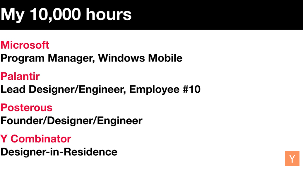
Even without formal design training, anyone who is intelligent and empathetic can learn to design. I never received professional design education but taught myself through practice. I didn’t just code—I also used Photoshop to imagine and construct what I wanted. Before turning ideas into code, I constantly considered how people would feel and tried to understand who I needed to become.
As the 10th employee at Palantir, I worked as a project manager. In 2008, YC funded my startup, Posterous. Posterous exemplified some of my early product ideas and demonstrated how such thinking could shape the future development of New York-based startups.
Initially, I spent ten years working as a designer in residential architecture. Now, I work alongside more than a thousand founders. Like you, I built my first homepage from scratch and reflected deeply on my initial experiences.
What Is Design? Why Does It Matter?
Creativity is essentially about connecting things. The more knowledge you acquire, the richer your pool of connections becomes.
Design doesn't operate in isolation—it interacts with every other component. Therefore, beyond great design and engineering, customer support and product management are equally essential.
Especially during the startup phase, don't limit yourself. As the guardian of your product, you must handle everything. Viewing design as part of the broader picture of building exceptional products is crucial.
“Most people make the mistake of thinking design is what it looks like. People think it’s ‘skins’—that the designer gets handed this box and told: ‘Make it look good!’ That’s not what we think design is. It’s not just what it looks like and feels like. Design is how it works.” — Steve Jobs
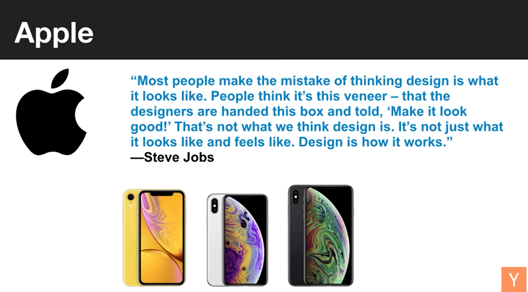
To me, design means creating something that works well and brings joy to users.
Yet, we often see different approaches to design. In my view, one of the world’s most inspiring companies embeds design at the very core of how they operate.
Clearly, you can't discuss design without mentioning Steve Jobs and Apple. But the most common misconception is equating design solely with appearance. In reality, design goes far beyond aesthetics—it's fundamentally about functionality.
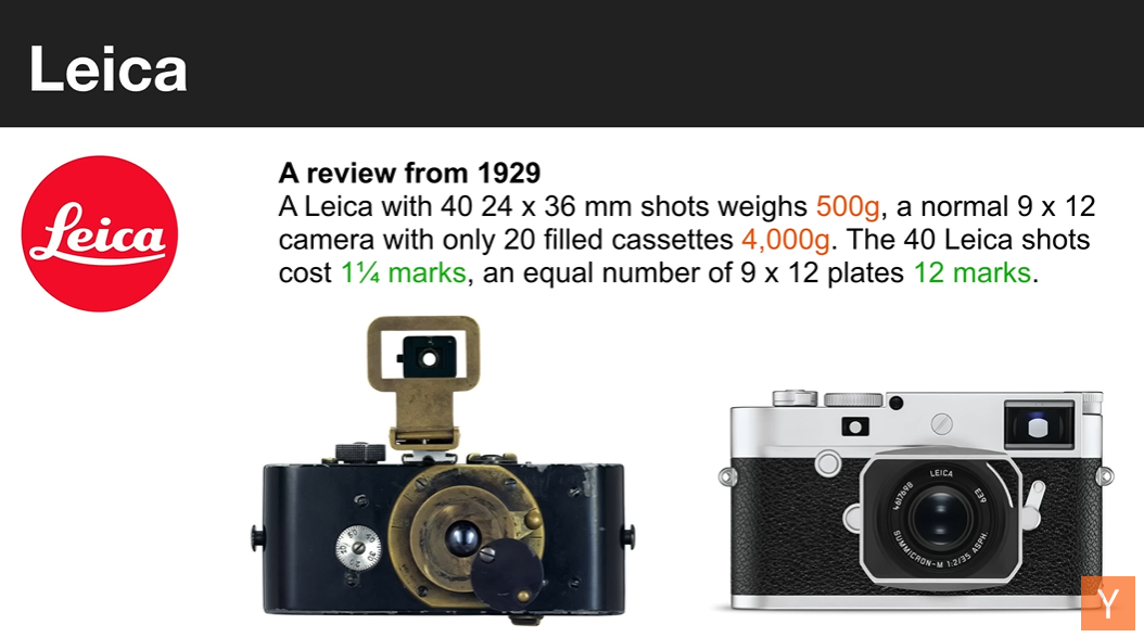
Leica, as a brand, stands out for its beautiful form and powerful brand identity while remaining highly practical. More importantly, it addresses deep functional questions: Why is it better than all previous products?
In fact, a 1929 review already made it clear: the Leica camera was virtually magical—eight times lighter and ten times cheaper.
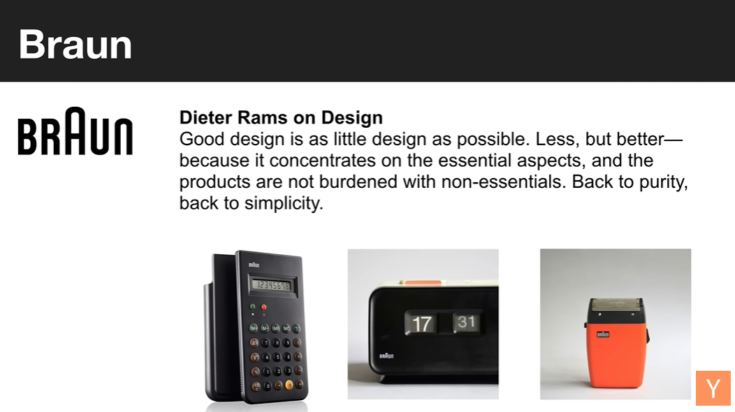
For physical products, one of my greatest sources of design inspiration—shared by many—is Dieter Rams. He created numerous simple, elegant, and highly functional products.
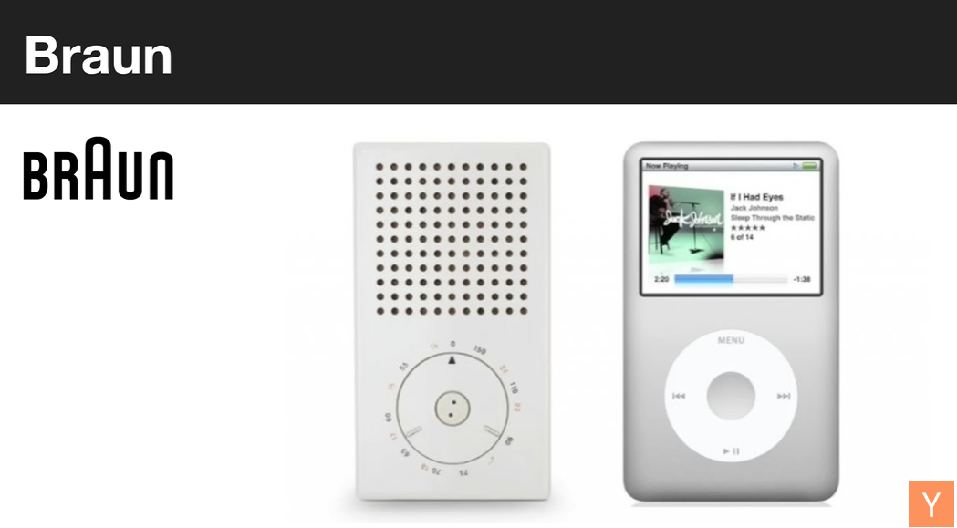
In my opinion, the most important lesson he taught us is that good design is actually as little design as possible.
Minimalism
We’ll revisit minimalism several times throughout this presentation. The key lies in creating products that don’t require excessive features—products that are truly pure and simple, easy for users to adopt, and capable of leading the market.
History doesn’t repeat itself, but it rhymes. As designers, you shouldn’t spend too much time trying to be radically novel, because novelty often conflicts with usability.
In other words, we should prioritize utility and function over novelty. Only then can we create products that genuinely meet market needs.
Form vs. Function
Earlier, we discussed form and function as opposing forces and reached a consensus. When designing a product, we always aim for beauty, pleasant user experience, and engaging interactions, while also valuing novelty and delight.
We want our product to capture attention, feel unique and interesting, and encourage long-term usage. Yet functionality remains paramount—if a product looks great but lacks practicality, users won’t stick around.
However, in practice, form often overshadows function—even with otherwise excellent products.
For example, certain Apple products may emphasize form over function, serving as classic cases of “form over function.” This typically happens in marketing strategies where marketers highlight appearance and novelty to attract consumers, neglecting intrinsic utility.
Such an approach can degrade user experience. Imagine going to a beautifully decorated restaurant: the seating is romantic, the ambiance thoughtful—but when you get the menu, it’s unreadable, and ordering anything else proves difficult. This is a perfect example of form over function. Despite stunning decor, poor usability leads to a worse overall experience. This occurs across industries, so balancing form and function is essential to creating truly satisfying products.
Don Norman discusses this in his book *The Design of Everyday Things*, devoting an entire chapter to door design. Even though doors are among the simplest, most intuitive objects, due to prioritizing form over function, many people still struggle to use them correctly. Thus, function should drive design—not form.
Empathy
As a founder, I deeply understand the value of empathy. Paul Graham gave us an incredible piece of advice: understand your users’ thoughts, feelings, and needs. Even if we ourselves can use the product, we must consider others’ experiences. Empathy allows us to see things from their perspective.
I believe entrepreneurs must read and interpret others’ viewpoints, uncover real underlying needs, and treat users with compassion. YC’s motto—“Build things people want”—embodies this principle.
When building high-tech products, we shouldn’t treat them like complex machines—we should welcome users warmly, like hosting a party, solving their actual problems. This is the heart of design thinking.
In fact, starting a company is like throwing the best possible party. You need to treat your users politely, warmly, and thoughtfully—just as you’d guide friends into a gathering.
Clarifying Problems and Priorities
A core principle of design thinking is clearly defining the problem you’re solving; otherwise, there’s a risk of building something no one actually needs. Hence, in startup school or new product development, a critical step is gaining crystal-clear understanding of user problems and offering appropriate solutions.
Every product exists to solve a core user problem. For instance, if you purchase a product that fails to address your issue, it’s useless. To avoid this, cultivate empathy—focus on user needs and contextual interests, rather than chasing novelty or personal whims.
Ultimately, the goal is problem-solving—not artistic expression or pushing what we assume users want.
Types of Design
There are many types of design, with some prominent examples being design-driven companies—often hardware firms.
The variety of design reflects the diversity of human needs—it’s not a flaw. Architecture is absolutely a form of design, as are branding and identity, and various forms of communication design.
Additionally, furniture design, landscape design, packaging design, transportation design—all fall under the umbrella of design. Visual design is merely the final layer.
Product design is especially vital in startups, requiring clarity on the problem, target audience, and interaction methods.
It’s rare for co-founders within a team to naturally possess these skills.
Throughout the product lifecycle—from product design to interaction design to engineering—capturing requirements is indispensable. Therefore, individuals skilled in these areas are invaluable when seeking co-founders.
Product Design
In product design, business case and problem definition are critical. To tackle these effectively, integrate product management with the design process. Deliverables such as prioritization, feasible solutions, and PRDs (Product Requirement Documents) must be concrete and specific.
While there’s no single correct method for product design, using personas to represent target users helps. For example, the “Post-Hazard” persona. Personas serve as tools for designers or product managers to concretely define user traits and needs.
For our YC application, we aimed to solve the challenge of online publishing, since existing blog platforms were outdated. We believed email was a universal content delivery mechanism—an innovative idea at the time.
Eventually, we categorized users into three distinct types, helping us better grasp their needs and characteristics.
- Take David, the father figure. This involves gathering background details—school, family, phone, computer type, etc. We also needed to know which browser they used (Internet Explorer or Chrome?) and whether they used email. These insights help clarify user needs and inform decisions about key product features.
- Another persona was David’s family, particularly his grandmother. She uses an ASUS netbook and Hotmail but lacks technical confidence. Understanding tech comfort levels is vital for grasping user needs. Over the past five years, some of the best YC companies have expanded globally, proving that identifying target users remains valuable even for enterprise and B2B ventures. Different roles—decision-makers, managers, frontline workers—have varying needs and capabilities.
- Lastly, amid the dawn of social media and the Cambrian explosion of social networks, dozens of platforms emerged. We had to account for niche personas and tailor solutions accordingly.
Over the next two weeks or next sprint month, we need to define actual product features. While PRDs typically detail every aspect of what to build, brevity and clarity matter—we should organize features into coherent, meaningful units.
To achieve this, plain-text email communication proved effective. Posterous innovated by eliminating sign-up flows: users simply emailed [email protected] to publish content.
We added other functionalities: photo attachments, multiple file uploads forming a web library, video support, and more.
Early security measures were crucial—we prioritized user privacy and data protection. After being featured on TechCrunch, Michael Arrington endorsed and began using our platform.
Thanks to robust safeguards—including hack detection and email verification—user data remained secure. Though I’ve outlined steps here, this isn’t a rigid formula—sometimes alternative approaches are necessary.
User Research
Understanding user needs and spending time with them is foundational to customer development. This is the essence of user research. In startups, you should conduct this yourself—not outsource it.
Clearly articulating needs for specific user personas is vital.
Prioritization ensures realistic goals and enables cutting unnecessary elements.
During this process, p0 (highest priority tasks) are obvious, while p1 (next core steps) must be clearly defined before moving forward.
If your team doesn’t use a bug database, start immediately—it’s a key tool for managing and assigning priorities.
This ensures proper product development and smooth team coordination. Lower-priority items (p2, p3) often involve fine details, so prioritization must be handled carefully to ensure sound decision-making.
One crucial yet often unwritten aspect of product development is thinking about which personas or users need or want a feature, and how they interact with each other.
For example, allowing email-only posting without accounts prevents less tech-savvy users from fearing registration. Thus, account-free functionality opens access to non-technical users. Photo attachment support is also valuable, especially for power users with the latest iPhones.
Treating p2 and p3 items as part of specific sprints is beneficial. It helps separate the essential from the trivial as you progress.
Thinking about the product across different sprints is highly useful. Clarifying requirement priorities and understanding their value ensures the product evolves in the right direction and improves team efficiency, avoiding wasted effort.
When setting priorities, consider scope, quality, and time. Reducing scope shortens timelines, but quality must not suffer. If features are buggy or poorly implemented, the product fails.
Also, consider how personas influence product design, as users have different needs and security risks. All these factors are crucial—they enable smarter decisions and increase chances of success.
Interaction Design
In interaction design, we must clearly identify the user, understand the nature of the problem, and translate it into actionable components.
To address the problem, we must study user behaviors and goals to implement suitable solutions. During interaction design, prototypes or wireframes are required. Tools like Omnigraffle can help, but focus should be on actions and screen flow—not colors, visuals, or fonts. Layout is also important and must be considered.
One of the most fascinating aspects of interaction design is how people relate to computers. At Stanford, Professor Cliff Nass built an entire career on the insight that people treat computers like humans. If a computer behaves politely, people respond politely—and vice versa.
Interaction design is about guiding people—humans are easily influenced. Interaction designers aren’t just experts in button placement, layout, or flow; they must also be writers, using direct command language to guide behavior. Founders must avoid falling into passive design traps.
Command language tells people what to do—and they tend to follow. Many designers fall into the trap of passive voice, whereas direct, personal language drives action more effectively. Large companies may afford passive descriptions due to scale and resources, but startups must be explicit and direct to attract users.
Using command language motivates action. Calls to action must be prominent and clear. Telling users exactly what to do enhances UX, and contrast makes interfaces more compelling.
How to Get Users to Take Action?
Another key aspect of interaction design is prompting actual user action. Beyond direct command language, two mental models help solve this:
- Simplify processes by removing steps—e.g., eliminating password confirmation reduces cognitive load and increases signup conversion.
- Break down complex actions using wizards or guided flows.
During interaction design, avoid reinventing the wheel. Leverage established conventions and patterns—like pull-to-refresh or swipe gestures—because they’ve earned user trust and familiarity, helping users reach their goals faster.
Incorrect pagination is a common pitfall requiring caution.
On the web, small dots or swipe navigation may lack meaning, especially for trackpad users. Mixing such elements requires care—always consider what users are trying to do and whether the pattern makes sense.
Visual Design
Visual design and interaction design are distinct but closely related.
- Visual design uses images, color, and other elements to convey information and guide user actions;
- Interaction design focuses more on user experience, emphasizing the interaction between user and product.
In visual design, we must consider how to use visual elements to highlight the most important information. To do so, we must understand what users hope to gain from the product and what emotional experience they seek. These considerations shape our choice of tools and techniques, such as Photoshop or HTML/CSS.
However, we must avoid over-decoration. Good design shouldn’t just be visually appealing—it should solve problems. Focus on utility and minimize unnecessary elements.
Some design thinkers echo this view, such as Edward Tufte. In his book *The Visual Display of Quantitative Information*, he argues that excessive “chart junk” only distracts users. Therefore, visual design should be as clean and clear as possible, aligned with real needs.
We can apply basic principles to reduce decorative clutter. When removing an element, ask: does it affect user experience? When adding one, ask: is it truly necessary? The end result should be lean and functional, enabling users to quickly access information and solve problems.
Principles of Visual Design
There are three simple principles in visual design, the most important being contrast.
- Contrast can be expressed through boldness, color, or size to indicate importance. As a visual designer, you must distinguish between essential and non-essential elements. Avoid over-decoration—design should be minimal and functional.
- Another key principle is proximity—grouping related elements so they appear connected. This is especially important on login pages to prevent confusion.
- Visual hierarchy is created by combining contrast and proximity. Grids are powerful tools for establishing strong visual hierarchy. When designing grids, align elements and place high-contrast items strategically so users can quickly locate key information.
When browsing websites or apps, users scan for the highest-contrast elements to determine if they’ve found what they need. Thus, headlines are crucial in visual hierarchy. A clear hierarchy provides guidance, helping users find information quickly.
However, excessive lines and boxes can clutter the page. To avoid this, first decide what elements are needed, then use padding and margins for basic layout. Lines can be added later if necessary.
Finally, use high-contrast boxes sparingly—overuse leads to visual noise and confusion.
In summary, the key to visual design is applying simple principles to create clear, functional designs. Using tools like visual hierarchy, grids, and contrast, designers can help users quickly find what they need, enhancing user experience.
Whitespace is also highly effective in visual design. Proper spacing helps users focus on key elements and improves UX.
Contrast, grid systems, and color are among the simplest yet most effective tools in visual design. These techniques originated in Swiss design, exemplified by Helvetica font. Though simple, they produce outstanding results.
Beyond creativity, design includes usability testing and feedback. Poor signage and layout in airports can cause people to get lost. Therefore, anticipate user needs and confusion, and conduct usability tests to validate design effectiveness.
Usability testing can be done with wireframes or prototypes, interacting with users to ensure ease of use and catch issues early, reducing costly fixes later. Design should be grounded in user behavior and needs—not artistic expression.
Customer Support
Another frequently overlooked yet critical aspect is customer support. Though often dismissed as mundane, it’s actually at the root of many product issues.
In product development, requirements docs, wireframes, design, and shipping are visible parts—but only a small fraction. Real problems often stem from the long tail of bugs—seemingly minor issues that, when accumulated, erode product integrity and quality.
Thus, customer support is vital—it helps creators understand user needs and ensures usability. Designers, engineers, and product teams must collaborate closely with support to receive timely feedback and issue reports.
Therefore, a great product requires not just research, but integration of all these critical components—usability testing and customer support included. Every sprint should account for these aspects, dedicating time to refine the product based on real user needs.
Join TechFlow official community to stay tuned
Telegram:https://t.me/TechFlowDaily
X (Twitter):https://x.com/TechFlowPost
X (Twitter) EN:https://x.com/BlockFlow_News
 深潮TechFlow