

Understanding the Premium/Discount Rate: Get ETF Data 24 Hours Ahead
TechFlow Selected TechFlow Selected
Understanding the Premium/Discount Rate: Get ETF Data 24 Hours Ahead
The premium rate is real-time, while the fund data is delayed.
By Umbrella, TechFlow
Since the approval of spot BTC and ETH ETFs, daily ETF inflows and outflows have become a core metric for many traders when positioning their trades.
The logic is straightforward: net inflows signal institutional buying and bullish sentiment; net outflows indicate institutional selling and bearish sentiment.
But here’s the problem: the ETF data we see each day reflects the prior day’s activity.
By the time the data is released, price action has often already priced it in.
So—is there any way to anticipate today’s ETF net inflow or outflow *before* the official data drops?
Yes. The answer lies in the ETF premium/discount rate.
Verifying this pattern is simple—January 2026 (so far) offers an ideal case study.
As of January 28, U.S. equities markets had 18 trading days.
According to statistics, Coinbase’s premium index remained positive on only two days; the remaining 16 days all saw negative (i.e., “underwater”) premiums.
Corresponding ETF fund flow data shows that 11 of those 16 days ended with net outflows.
Notably, from January 16 to 23, the premium rate stayed continuously below −0.15%, coinciding with over $1.3 billion in weekly net ETF outflows—and BTC’s price falling from a high of $97,000 to around $88,000.
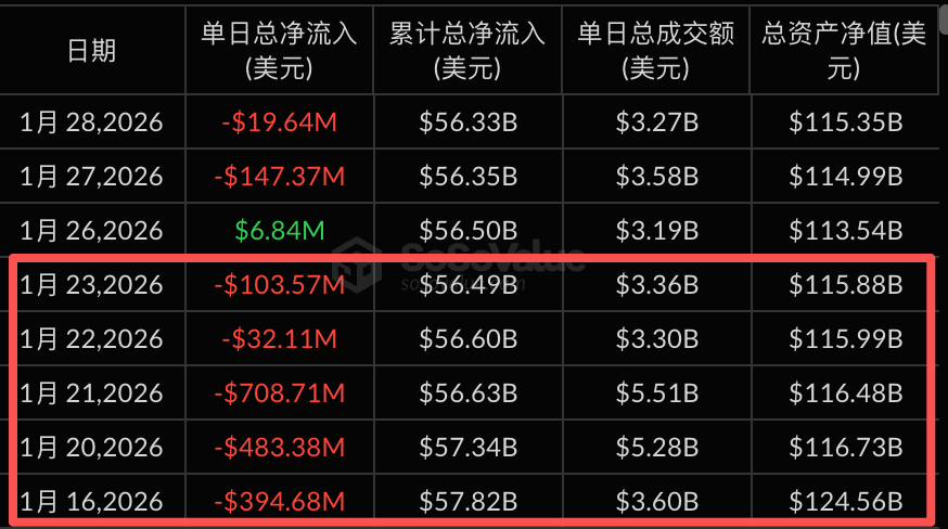
Data source: sosovalue
Let’s zoom out further.
From July 1, 2025 to January 28, 2026—a total of 146 trading days:
· Negative premium occurred on 48 days, with corresponding net outflows on 39 days—accuracy: 81%.
· Positive premium occurred on 98 days, with corresponding net inflows on 82 days—accuracy: 84%.
This is the value of the premium rate: it lets you see where money is flowing *before* most others do.
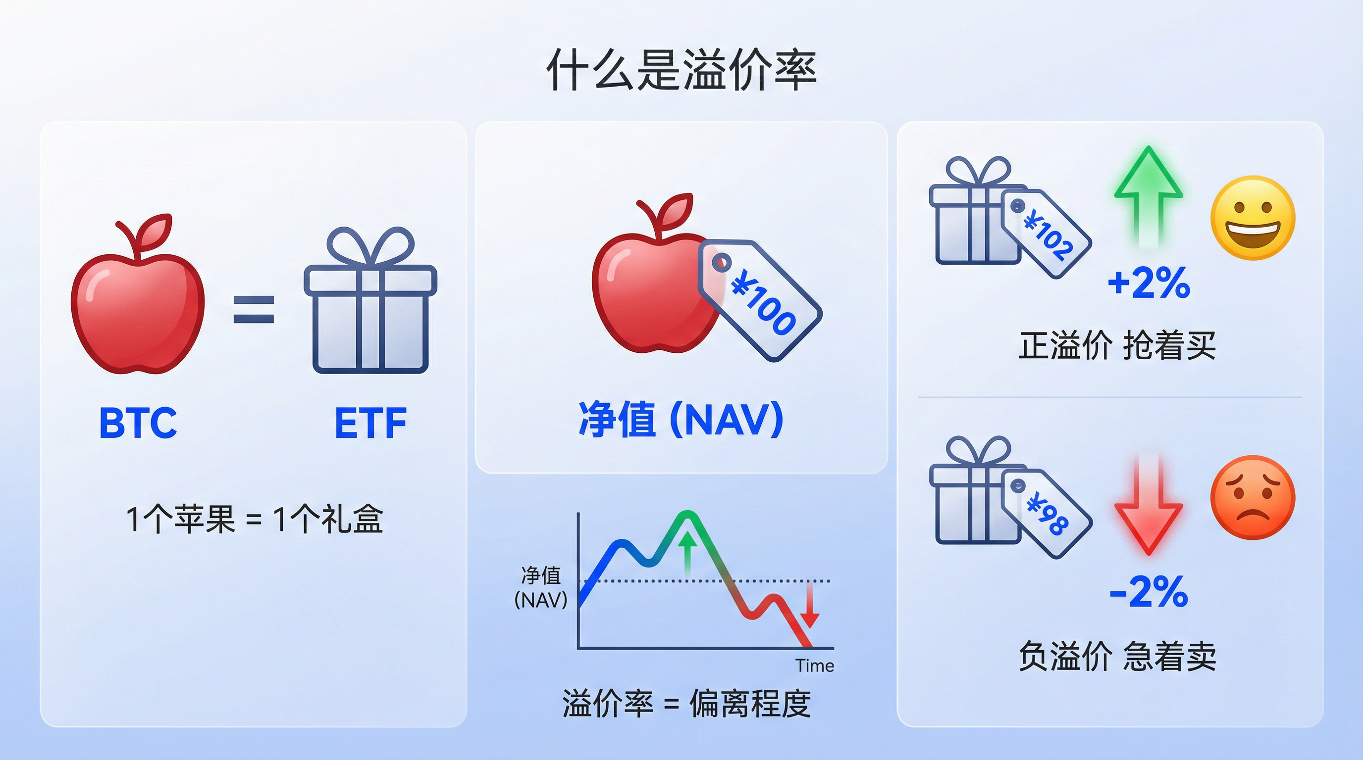
What Is the Premium Rate?
We’ve discussed the premium rate extensively—but what exactly is it?
Here’s an analogy.
BTC is like loose apples sold at a wet market; a BTC spot ETF is like a pre-packaged apple gift box sold at a supermarket—with one apple per box.
If one apple sells for $100 at the wet market, that’s the Net Asset Value (NAV).
The price of the apple gift box at the supermarket depends on supply and demand.
If demand surges, the box sells for $102—this is a positive premium, +2%.
If sellers dominate, the box falls to $98—this is a negative premium, −2%.
The premium rate measures how much the ETF’s market price deviates from BTC’s true underlying price.
A positive premium signals optimistic sentiment and strong buying pressure.
A negative premium signals pessimistic sentiment and urgent selling pressure.
Relationship Between Premium/Discount Sign and ETF Inflows/Outflows
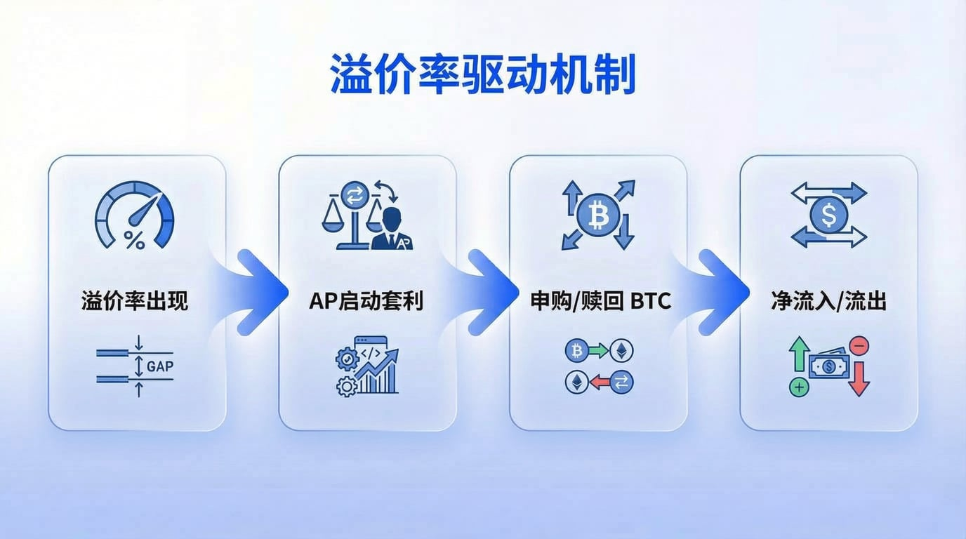
The premium rate isn’t just a sentiment gauge—it actively drives fund flows.
The key player here is the Authorized Participant (AP)—think of them as privileged arbitrageurs.
An AP’s core logic is risk-free arbitrage: they can create or redeem ETF shares in the primary market *and* trade ETF shares in the secondary market.
Whenever a price discrepancy arises, they step in to “brick-and-mortar arbitrage.”
When a positive premium appears (the box is pricier than the apple), APs buy BTC in the primary market, package it into ETF shares, then sell those shares in the secondary market for profit. This process results in BTC purchases and net fund inflows.
Conversely, when a negative premium appears (the box is cheaper than the apple), APs buy ETF shares in the secondary market, redeem them for BTC, then sell the BTC for profit. This leads to BTC sales and net fund outflows.
So the causal chain is:
Premium/discount emerges → APs initiate arbitrage → Creation/redemption occurs → Net inflow or outflow results.
Remember: the ETF fund flow data we see daily is finalized and published *the following day*.
The premium rate, however, is real-time; fund flow data is lagging.
That’s why the premium rate gives you an edge—allowing you to act ahead of the crowd.
How to Apply the Premium Rate
Now that we understand the mechanics linking premium rates to ETF inflows/outflows, how should we integrate this into our personal trading plans?
First, the premium rate is *not* a standalone indicator.
It tells us the *direction* of fund flows—but not their magnitude or duration.
Here are several complementary dimensions I recommend monitoring alongside it:
1. Duration Matters More Than a Single-Day Reading
A one-day negative premium may simply reflect short-term noise.
But consecutive days of negative premium strongly suggest sustained net outflows—and warrant caution.
Recall the five trading days from January 16–23: five straight days of negative premium corresponded precisely with five days of net outflows—and a nearly 10% drop in BTC’s price.
2. Watch for Extreme Values
Typically, premium rates fluctuate within ±0.5%—that’s normal.
Once they breach ±1%, market sentiment has clearly diverged, AP arbitrage incentives intensify, and fund flows accelerate.
3. Contextualize With Price Levels
Sustained negative premium at elevated price levels may signal early capital flight.
Sustained positive premium at depressed price levels may indicate bottom-fishing capital entering the market.
The premium rate itself doesn’t constitute a buy/sell signal—but it helps validate current trends or detect potential turning points earlier.
Final Thoughts
Finally, a few important caveats.
No indicator is a silver bullet—the premium rate’s reliability assumes AP arbitrage mechanisms operate normally.
In extreme conditions—such as the October 11 crash—market liquidity dries up, arbitrage breaks down, and the correlation between premium rate and fund flows weakens.
Also, the premium rate is just *one* window into ETF fund movements.
For seasoned investors, it’s merely one piece of the puzzle.
We recommend multi-dimensional cross-verification using the following indicators:
- ETF Holdings Changes: Rising holdings indicate institutions accumulating positions; declining holdings suggest de-risking. More direct than premium rates—but subject to reporting delays.
- Futures Basis & Funding Rates: A positive basis coupled with rising funding rates signals overheated long sentiment—and potential excessive optimism. The opposite suggests bearish dominance.
- Options Put/Call Ratio: Puts are bearish options; calls are bullish. A rising ratio signals heightened risk aversion; a falling ratio indicates prevailing bullishness.
- On-chain Large Transfers & Exchange Net Inflows: Large BTC inflows into exchanges often presage selling pressure; large outflows suggest accumulation or “HODLing.”
For example:
Suppose you observe: consecutive negative premiums, declining ETF holdings, and rising exchange net inflows.
All three signals point in the same direction—capital is exiting, and selling pressure is building.
At that moment, you should at least raise your alert level and reduce exposure—not rush to “buy the dip.”
No single indicator reveals the full picture. Only multi-dimensional cross-verification improves decision-making accuracy.
In this market, the more dimensions you observe, the smaller your information gap—but a time lag will always remain.
Who sees capital flows first gains a crucial edge.
Join TechFlow official community to stay tuned
Telegram:https://t.me/TechFlowDaily
X (Twitter):https://x.com/TechFlowPost
X (Twitter) EN:https://x.com/BlockFlow_News